Happy 4th of July!
When I was a little kid, a damn adorable little kid, I couldn't sleep before the 4th- I was that excited to play with sparklers and firecracker 'chickens' and SNAKES.
I wish I could still be excited to light a smoke bomb and jump over the nasty smelling blue smoke.
Instead of possibly blowing off a finger, I decided to stop buying product and USE some of it...
That's right! FOR REAL! I sat down at my table and made a new page!
Last week, I was sending pics to Walgreen's for my boss- and threw in a few of my own. She picked them up and brought them to me the next day. I've been sitting, looking at them since- you know how it is, you lay in bed reading blogs and listening to the TV and every so often- glancing at the pile of pictures you intend to work on- and then the moment passes and you find something else lazy and worthless to do...
Well, this morning, I woke up bright and early at 11am, full of the 4th of July spirit and sat down at my table.
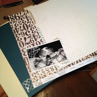
First, I sat down on the floor and picked through a mountain of paper. Most of which I had no memory buying. I'd like to say that I flipped through paper at a bionic speed- but it actually took nearly an hour and thirty minutes to come up with that little stack of eye-catchers up there...
I should've timed myself- It feels like this was a four hour process. I sprayed, cut, stamped, moved and moved and moved things around. The My Mind's Eye paper with the hexagons made many trial appearances in the work in progress but was eventually left behind.
I used the new 'Washers' border die from Mr. Holtz to cut a 'mask.' Like I saw someone do somewhere- I'm thinking it was on the Sizzix blog- I'm pretty sure of it... I love this die. I recommend it- go buy it.
Here's my new page:
There's a little bit of everything on there- the base is a piece of plain manila cardstock from Jo-Ann, misted with some Calico White Mister Huey and Frequent Flyer Sprinkler from October Afternoon. Next layer is some ledger paper from 7gypsies. The 'Numbers' paper was a 5 for a dollar Michael's brand special. The light blue with dots and the bone sticker are from Echo Park's Mini Theme 'WOOF' kit. More 'Numbers,' then a strip of light pink cardstock (I think it's from the Tim Holtz paper- but can't remember). There's some washi tape, can't remember where it came from, some letters from Authentique- and of course, the photo is of my dearest child, Nelson. May he rest in peace.
I seem to like to use my handwriting somewhere on every page- I don't do much journalling, but I like to write something-
I like the way this stamp (from Michaels, the Hampton Art 3.99 big-ass wood mounted bargain stamps) turned out, stamped over the misting in Antique Linen Distress Ink.
Okay, that's it- I bought a fresh bottle of mixer- uh, I mean, cranberry juice. It's healthy, dammit. Good for your... kidneys or something? Well, adding a splash of it to a glass of vodka is a great way to enjoy the summer afternoon. From the comforts of the air conditioned den. And the vodka is healthy, too- it's like...mouthwash. It's antibacterial or something.
Have a great 4th of July, everyone!
-kory


I love it!! And Nelson was an adorable little dude. I love how you layered things - you need to teach me, I'd love to be able to do that! :)
ReplyDeleteSuper cute layout!
ReplyDeleteLove the washer die, did you use plastic to make the mask" very creative. Love the circle stamp, I have the same one. Isn't it cool? Also love the layering and misting. He looks like he was a sweet dog.
ReplyDeleteGreat layout Kory. Love the subtle effect you've achieved in the background. And personally i've always preferred layouts where journalling is zero or kept to a minimum. Pity I tend to fill mine with a load of garbled nonsense haha. Good to seeing you're treating your body like a temple with vodka and cranberry smoothies. Think I'll nab the idea for my breakfast drink :) Pxx
ReplyDeleteOH KORY!! So glad to see you scrapping again friend. This layout is fantastic, and I agree with Paul, the background is so beautiful, you have achieved an intense and deep effect, I love it, truly stunning. That washer die is amazing by the way, might have to look into that one, perfect picture, cute ink splatters, ingredients for a perfect layout, well done!!
ReplyDeleteHugs! Frank
Wow, Kory K! This is amazing! Why in the heck don't you make more layouts?!!! L O V E IT!!
ReplyDeleteLove ya,
HL
Great page! How adorable was Nelson :) Glad you enjoyed your ... ummm... errr... splash of cranberry juice did you say? LOL
ReplyDeletelove the layout..am a big fan of Tim (am gonna see him in about a month!) and I agree, you should do more layouts! Pinned this @ Pinterest :) (and linked of course !)
ReplyDelete