I've spent the evening watching the opening ceremonies from the Olympics. Wow. I mean 'wow' in the 'what the hell is up with the giant baby that looks like it's head has been cut open?!' way, not 'wow' in the 'oh what a beautiful show,' way. And I hate to sound heartless, but- I hate the sound of children singing. And the opening ceremonies were mostly that. As if that's a big surprise. Just as I was shouting, 'Is there anything more cliche?!,' I was reminded- yes, there is something more cliche than children singing at a 'big, momental event.' What is it? You know what it is- it's having the children sing WHILE DOING SIGN LANGUAGE. Not that I have something against sign language or even ANY language- but really? Someone was paid to come up with a big, hopefully awe-inspiring, production and the best they could do at any given moment is to fall back on one of the most over-used 'moments' from a grammar school Christmas show?!
Well, my commentary was nonstop. I should've rented a space and sold tickets for people to watch the ceremonies as I commented over a microphone. If you think I'm funny during CRAFT WARS: LIVE, then you should've been at my house for my deconstruction of the opening ceremonies.
But, the night got better. I saw something that excited me.
What was it?
It's Prima's new CRAFTSMAN collection. Have you checked it out, yet? You should. Here's my highlights:
Check out this mask:
You could use it as it, or just use the gear parts, or just use the circle parts. At the moment, masks are some of my favoritest thangs. Especially ones that have a multi-use possibility!
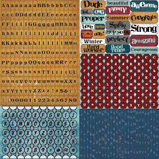
Next: LETTER STICKERS!!!
I should've warned you before the pic- but I didn't. I'll tell you now. IGNORE the stickers in the upper right corner. Really, Prima? You couldn't do a masculine theme without throwing 'DUDE' in there, could you? To any companies out there who might deign to read any of my harsh yet (truly) constructive criticism: you might think you're aiming at pleasing the mainstream with the cliché- but you must remember, the kind of people who might embrace this are not your good customer. Be true to the theme and always, always, keep it classy. But the rest of the stickers more than make up for the very very slight affront to taste, dude. Especially the set in the bottom right. Great color, great look - and as far as I can tell, not similar to anything already out there! I love those! I love the upper right section, but they're a bit too similar to a set from Mr. Holtz's sticker pads to be impressive. But I still like them.
Okay, NEXT!
Beautiful paper! Perfect! The blueprint theme seems to be a trend, right now. And I love it so much.
Time for some STAMPS!!!
Excuse me, I must have a moment.
Thank you. The lightbulb?! The gears. The compass. Even the BOOM. So much fun. And two bucks?! Last I checked, the biggest thrill was on a corner for twenty bucks. You have it beat, Prima!
More sexy paper. Sexxxy. Would look great as is and even better if cut up to use each segment as part of a layered embellishment or background for a card or... just laying in a stack of your sexxxy papers, where it's easily accessible for viewing and admiring purposes.
PINS!
What is up with my love of pins? I don't think I've used any, but I have a few. And now, I will have more. The gear and the lightbulb are the best. The balloon is close, tho, in third. The pointing finger is nearing 'children singing while signing' saturation point, and I don't know what the hell the little monster is... I want these. So much that I'm a little bit angry that scrapbook.com isn't a store down the street, open 24 hours and waiting for me to come in and snatch them up in my hot hand.
Everything is currently available in the SUPERSTORE at Scrapbook.com.
Alriiiiight then? I'm off. Gonna enjoy this LOCKUP marathon on MSNBC. Opening Ceremonies? Olympics, PLEASE- this is quality television. Maybe I'll get lucky and it'll be the episode with the wild and crazy lesbian loan sharks. Just like Mr. John Waters, I've always had a soft spot for the female juvenile delinquent.
-kory


